
Padcaster In Education Magazine
Padcaster is a tech company that sells software and hardware to education industries. I provided the magazine with a modern facelift, focusing on improving user experience. Intuitive layouts were designed for seamless navigation, enhancing fluid user interaction.
Tools Adobe InDesign, Illustrator, Photoshop, InDesign Publish Online

-
Problem
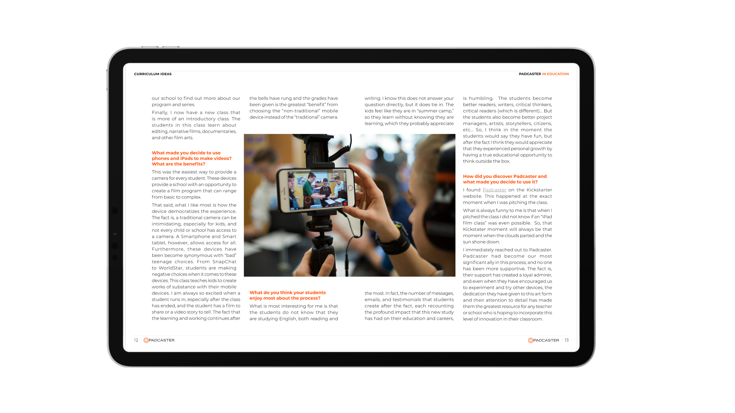
Padcaster in Education, Padcaster's digital magazine, required a significant update. The original design, crafted by an employee without a creative background, lacked seamless user interaction and featured unappealing layouts. With 170 pages, navigation was cumbersome, and key statements were hidden. The color palette, text style, and typography did not align with branding guidelines, and despite being a digital magazine, it was often printed by consumers like teachers.
Solution
To address these issues, I provided the magazine with a modern facelift, focusing on improving user experience. Intuitive layouts were designed for seamless navigation, enhancing fluid user interaction. I aligned all designs with branding guidelines by transforming layouts, colors, and font styles. To facilitate navigation, I introduced menus and buttons. To aid in the magazine’s responsiveness I then embedded all media files. Additionally, I enhanced the magazine's aesthetics with kinetic typography, visually appealing designs, and the incorporation of motion graphics and animation


